Words at work
Tips, advice, inspiration, and stories about content strategy, brand leadership, writing, and more.

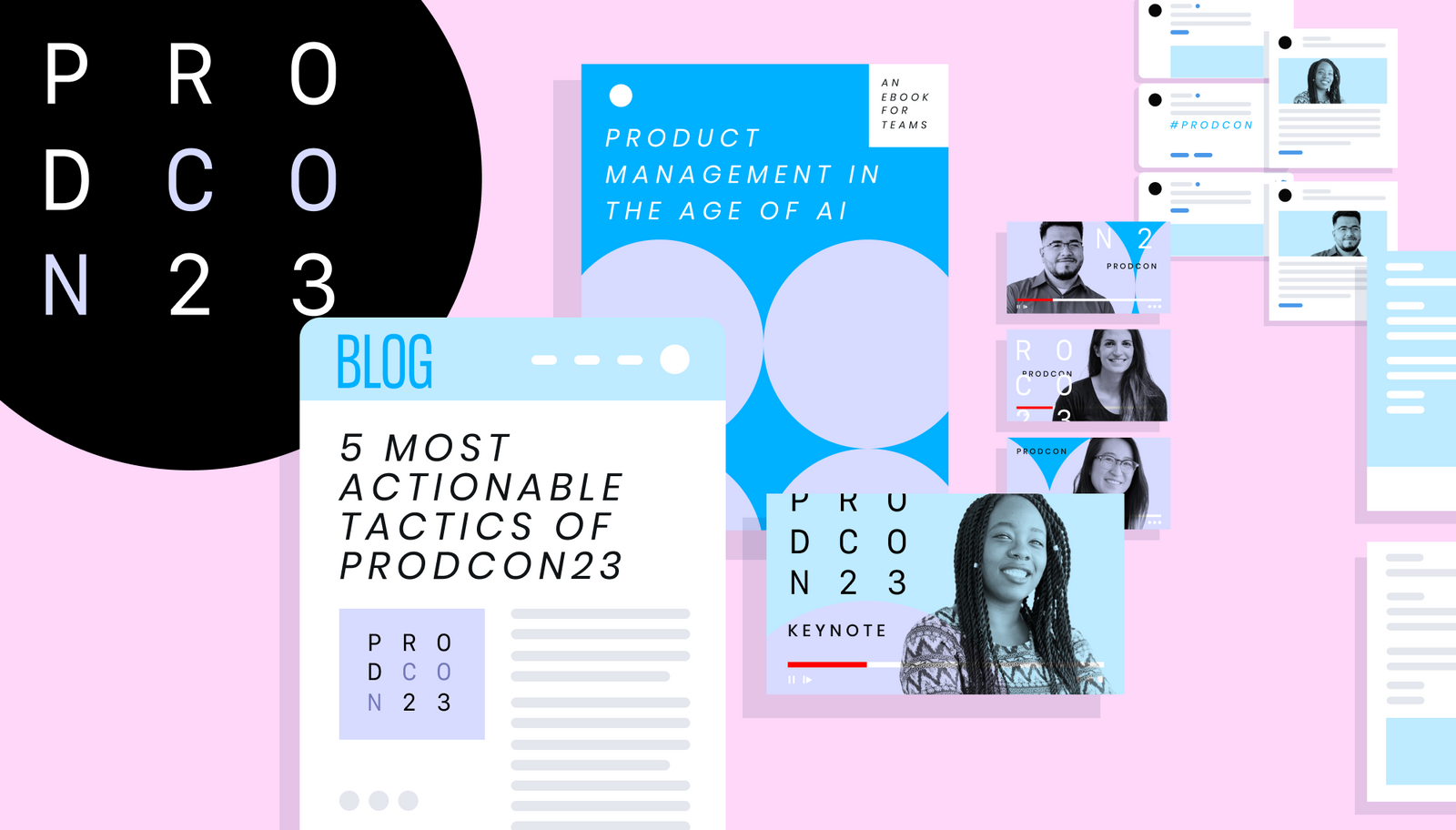
Words at work
– 10 min read
Content distribution: How to build buzz and engagement every time you hit “publish”
Alaura Weaver
Words at work
– 8 min read
The content repurposing strategy: your key to avoiding content burnout

Anna Burgess Yang

Words at work
– 14 min read
4 lessons from media publishers that B2B companies can use in their marketing
Alaura Weaver