
Enterprise transformation
– 8 min read
The AI leadership gap: Even marketers who use AI fear they’ll be replaced
42.5% of marketing employees fear AI replacement. WRITER’s 2026 survey reveals the leadership gap — and the four moves CMOs need to close it.

Diego Lomanto, CMO


Enterprise transformation
– 8 min read
What Cannes confirmed: Brand is the moat, AI agents are the engine
Diego Lomanto, CMO
Enterprise transformation
– 8 min read
The AI leadership gap: Even marketers who use AI fear they’ll be replaced
Diego Lomanto, CMO


Enterprise transformation
– 6 min read
Key findings from our 2026 AI adoption survey — and why CMOs should care
Diego Lomanto, CMO

Enterprise transformation
– 15 min read
Stop selling AI efficiency to your CFO. Here’s what finance actually wants to hear
Diego Lomanto, CMO

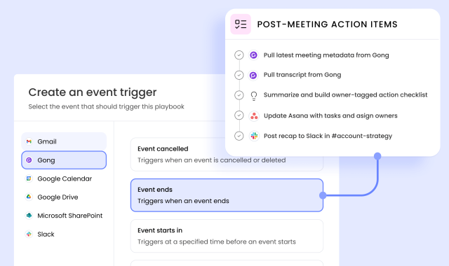
AI agents at work
– 10 min read
This AI agent analyzes and reports on your key pipeline trends

Ben Popper


AI agents at work
– 10 min read
Everyday automations: two simple agents that save marketers hours of work each week
Ben Popper
AI agents at work
– 10 min read
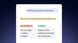
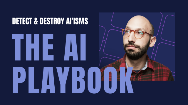
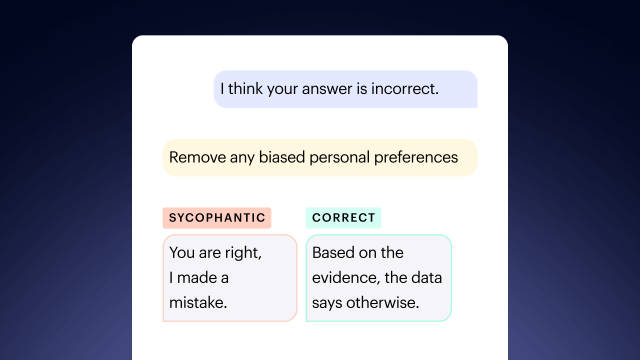
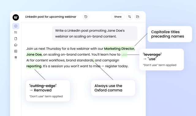
Detect and Destroy the AI-isms Ruining Your Marketing Copy
Ben Popper


Humans in the loop
– 5 min read
The metagame: How WRITER’s Diego Lomanto reads the agentic future of marketing
Alaura Weaver
Innovation
– 10 min read
New at WRITER: More autonomy for agents, more control for admins
Writer Team
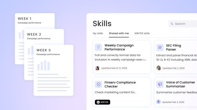
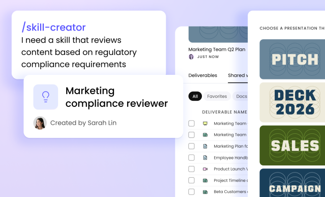
Innovation
– 17 min read
How WRITER Skills turn your team’s expertise into reusable AI capabilities

Marisa Almeida


Inside WRITER
– 5 min read
Beyond “the AI show”: Operationalizing agents at the WRITER Chicago roadshow

Lindsay Poirier, Area Vice President, Sales
Inside WRITER
– 4 min read
Your AI journey starts here

April Trask, Head of Customer and Partner Education

Inside WRITER
– 5 min read
Introducing the new partner program enterprise AI actually needs

Maureen Little, SVP of Partnerships and Ecosystem