Inside Writer
– 7 min read
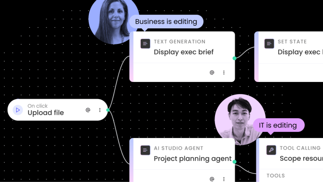
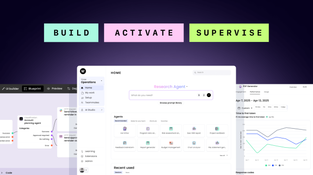
Introducing Agent Builder
Build enterprise AI agents with WRITER’s Agent Builder. Collaborative workspace for business & IT teams to co-create scalable AI solutions.
Writer Team


AI in action
– 7 min read
Beyond automation: How agentic AI is reshaping CPG

Kushala Silva, Global Head of CPG

AI in action
– 10 min read
Prudential’s journey with WRITER: Past lessons, present practices, future possibilities
Writer Team

AI in action
– 11 min read
From denim to data: American Eagle’s seamless transition into AI-powered retail
Writer Team

AI in action
– 6 min read
CPG shared services are at an inflection point: Time to reimagine and reinvent
Kushala Silva, Global Head of CPG

AI in action
– 9 min read
Empowering teams with AI agents: Learn from the real-world success of Uber
Writer Team

AI in the enterprise
– 7 min read
AI gets serious: A CMO’s take on the new reality at Cannes Lions 2025

Diego Lomanto, CMO
AI in the enterprise
– 9 min read
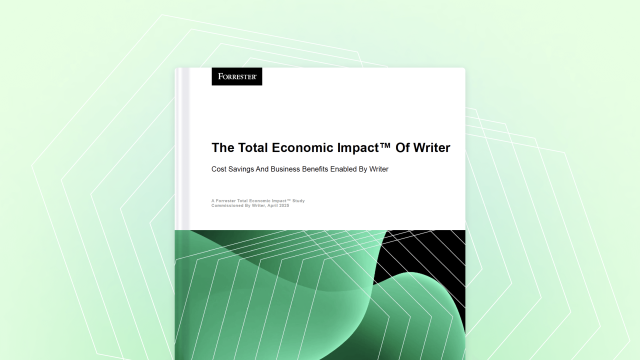
Key Findings from the Forrester Total Economic Impact™ study on WRITER
Writer Team

AI in the enterprise
– 13 min read
Beyond SEO: The triple-threat optimization strategy for visibility in the AI era
Alaura Weaver

AI in the enterprise
– 9 min read
Five ways AI vendors should support the adoption process
Writer Team

Inside Writer
– 5 min read
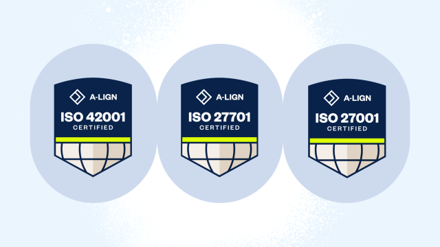
WRITER achieves ISO trust triad, setting new standard for security, privacy, and responsible AI in the enterprise

Ryan Maple, Head of Information Security and Compliance

Inside Writer
– 7 min read
Introducing our new industry leaders in financial services, healthcare, retail, and CPG
Writer Team


Humans of AI
– 10 min read
Building with words: Retail storytelling with WRITER’s Ranjan Roy
Alaura Weaver

Humans of AI
– 9 min read
Curing broken healthcare systems with AI: Zayed Yasin, WRITER industry lead
Alaura Weaver

Humans of AI
– 9 min read
From financial services to AI leadership: Dilshoda Yergasheva’s pathway to WRITER
Alaura Weaver

Humans of AI
– 9 min read
From P&G to WRITER: How Kushala Silva is helping CPG giants win the AI race
Alaura Weaver


Words at work
– 10 min read
Content distribution: How to build buzz and engagement every time you hit “publish”
Alaura Weaver
Words at work
– 8 min read
The content repurposing strategy: your key to avoiding content burnout

Anna Burgess Yang

Words at work
– 14 min read
4 lessons from media publishers that B2B companies can use in their marketing
Alaura Weaver