Words at work
– 7 min read
10 of the best content style guides in tech

Devon Delfino
A style guide is a vital part of creating a cohesive brand. And for tech companies — which often deal with complex topics that the average person may not be familiar with — it’s even more important. A style guide can help turn a company from another name in the vastness of Silicon Valley to a trusted brand that people turn to for their specific needs.
The examples highlighted here aren’t the only tech style guides of note (check out What are the best style guide examples? for more), but these do provide a solid jumping-off point for understanding what makes a good style guide for a tech company.
With that in mind, here are 10 awesome tech style guides to emulate and learn from.
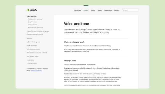
1. Shopify
Structure is the name of the game for Shopify’s style guide. The left sidebar makes it easy for users to navigate between sections, and the strategic use of headers within those sections make it scannable. That’s important if you want to catch a wide variety of readers while providing a detailed guide, even those who may not be reading deeply. It also walks readers through the company voice and gives explicit “do’s” and “don’ts” that help demystify the voice of the company.
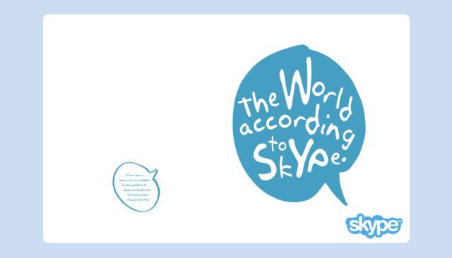
2. Skype
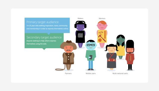
Skype’s style guide does a great job of illustrating (quite literally) the desired voice of the company. The writing itself shows how readers can and should implement their voice in written content. And the “words we like” and “words we don’t like” sections showcase concrete examples of good and bad uses in a clear, concise way. It’s also worth noting that this style guide includes sketches of five different user profiles they’re trying to appeal to, which can help readers better understand who they’re writing for.
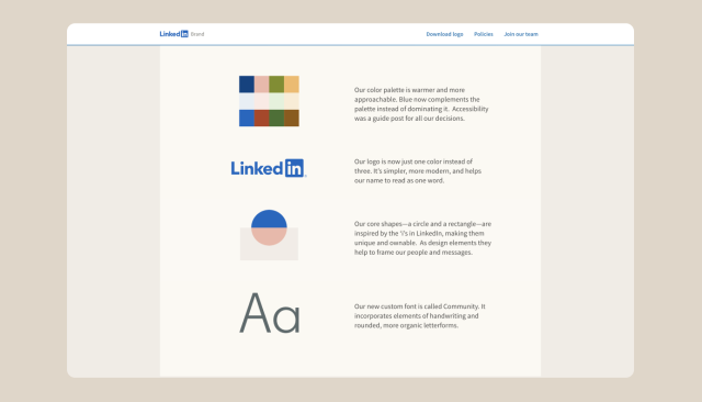
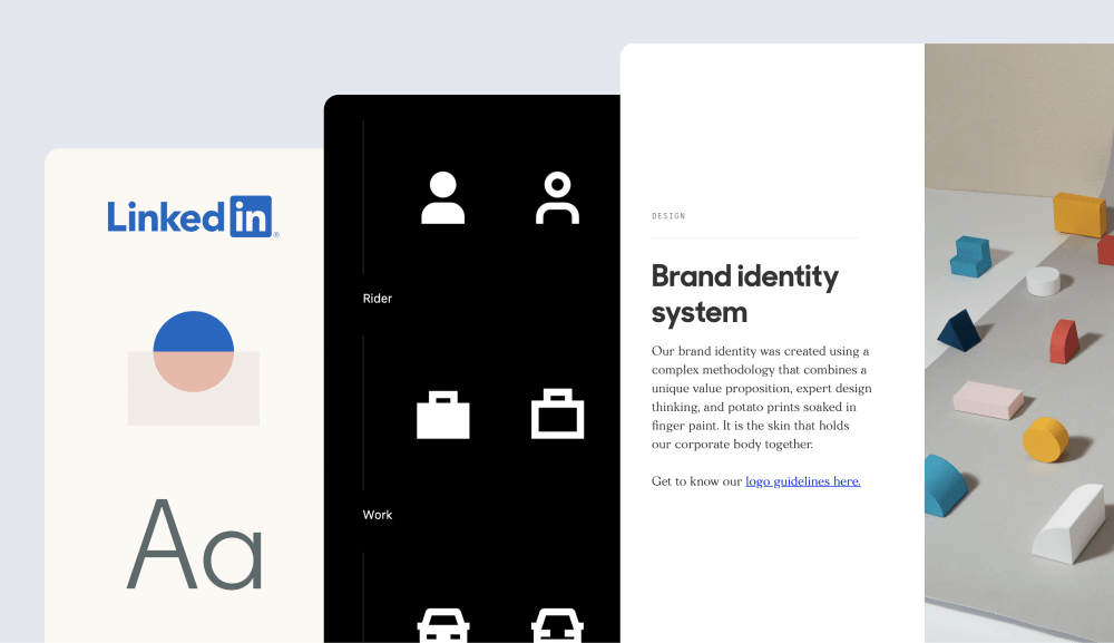
3. LinkedIn
Although it’s much shorter than many of the other guides on this list, LinkedIn’s brand guidelines do provide a solid introduction to their style, including voice. It accomplishes this by showing a cohesive representation of the brand — and that makes it easy to see how the voice, photos, and overall design come together to create the brand. Another advantage to this minimalist approach is that it won’t overwhelm readers. They can get through a taste for the brand in just a few minutes.
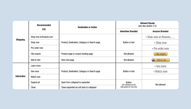
4. Amazon
Amazon’s brand usage guidelines provide a great example of showcasing the appropriate use of company branding. This is particularly true in the way they talk about call-to-action messaging. The section begins with a brief overview of what CTA’s are and why they’re important, before transitioning to a highly digestible chart that helps readers understand the proper uses of those CTA’s at a high level. Finally, the guide gets extremely detailed for each of those CTA uses, adding more context, and showing visual examples of what’s allowed and what isn’t, driven home with red and green color-coding.
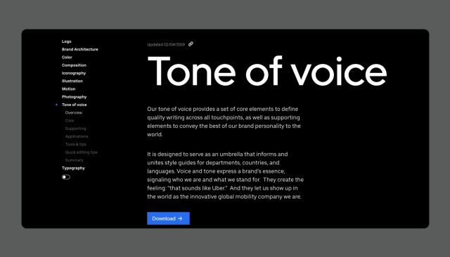
5. Uber
Uber’s style guide does a great job of providing valuable context around how to successfully use the voice in writing and tips for getting it right. The page also incorporates simple link-copying for each section, which gives readers a quick and easy way to reference it later on.
Another extremely useful aspect of this page is the update message at the top of the page. By stating when each page was updated last, it gives the reader enough context to understand how current the information is, and therefore, how much stock to put in it. And on the back end, allowing for these pages to be updated on a regular basis gives the brand the freedom to grow.
6. Webmaker
Tech companies are at a much higher risk of lapsing into potentially confusing jargon when it comes to brand. Webmaker’s style guide tackles this head-on by putting the emphasis on avoiding jargon when talking to their customers. The user-first approach is similar to Skype’s guide as the company gives examples of their target audiences. It also offers context around the types of devices users are likely to be on when accessing their products, which invokes different sets of rules. All of this, plus the writing of the guide itself which reflects their core values, comes together to show the reader how to speak to their customers in a clear, effective way.
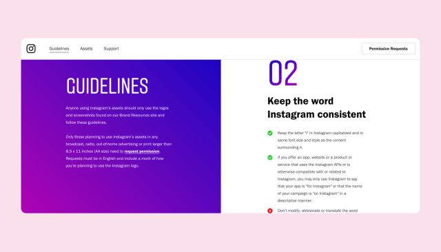
7. Instagram
Much like Shopify, Instagram makes good use of color-coding in its guidance on things like proper usage of the brand name. Their brand guidelines aren’t akin to many of the other style guides listed here, but it is still a vital part of the equation when it comes to guiding readers through the needs of the brand and how to talk about it. And this guide provides solid, easy to follow guidelines for their partners and anyone else who wants to use their branding, which matters a lot for a company that is so public-facing.

8. Salesforce
It may seem somewhat daunting at first, but Salesforce’s voice guidelines do a great job of breaking things down, including addressing the “why” question for voice upfront. By giving the reader an understanding of why it matters, they’re more likely to use the information. That can be an obstacle when implementing a style guide, particularly in a company that hasn’t had one previously.
Another notable part of this document is the next-level use of examples. Not only are they given in the somewhat visual format of screenshots — which can make it easier to take in, particularly in a document filled with text — but the guide spells out who the audience is, the goal of the example and the tone employed. The more detailed you can get with it, the more likely it is that a reader will stick to and understand the voice of the company.
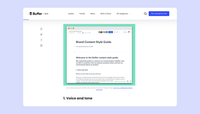
9. Buffer
Buffer doesn’t directly give the public access to their style guide, but the company does provide a helpful article that walks readers through the nuances of their company voice. And that article is another great example of how to guide the reader through the voice. For example, they provide resources, via links, to additional reading. That’s essential for a company that opts for a less comprehensive approach in their style guide and can help reduce the amount of information thrown at the reader in one go.
Also, since the article is written using the voice that the article describes, it actually serves as another example of what to aim for. That’s similar to Skype’s style guide. While it may not be necessary, it is a great bonus that can elevate an already solid style guide.
10. Zendesk
Zendesk’s style guide does an excellent job of walking the reader through the company philosophy, to the brand attributes and messaging. By providing this flow of information, it’s easier for the reader to get a solid grasp of voice. And the inclusion of specific phrases — like “Be the company your customers want you to be” — combined with guidance about when to use it, make the messaging section even more useful. That’s helpful in creating a cohesive voice.
Want to scale your content and automate your style guide? Check out Writer’s style guide feature.
More resources


Words at work
– 14 min read
How to write better: a quick-start guide for anyone and everyone

Anne Ichikawa