Innovation
– 6 min read
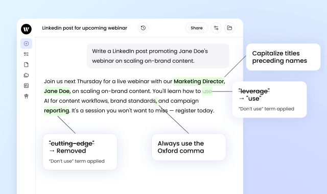
New at WRITER: Brand systems built for an AI era
Scale brand consistency in WRITER with unified voice profiles, terminology lists, style guides, connected workflows, and shared Projects for every team.
Writer Team


Enterprise transformation
– 6 min read
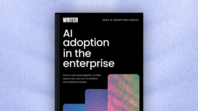
Key findings from our 2026 AI adoption survey — and why CMOs should care

Diego Lomanto, CMO

Enterprise transformation
– 15 min read
Stop selling AI efficiency to your CFO. Here’s what finance actually wants to hear
Diego Lomanto, CMO
Enterprise transformation
– 10 min read
Enterprise AI adoption in 2026: Why 79% face challenges despite high investment
Writer Team

Enterprise transformation
– 16 min read
Your next headcount is an AI Agent Owner: The new roles that define a successful agentic enterprise

Jevan Soo Lenox, Chief People Officer

AI agents at work
– 10 min read
Everyday automations: two simple agents that save marketers hours of work each week

Ben Popper
AI agents at work
– 10 min read
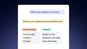
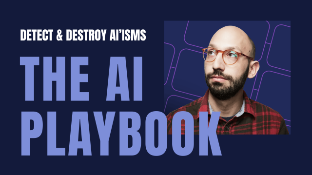
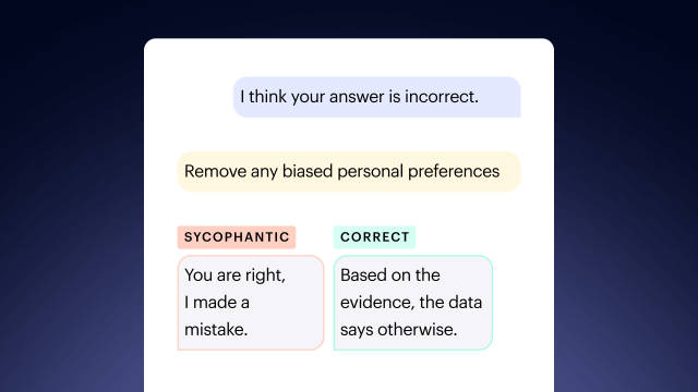
Detect and Destroy the AI-isms Ruining Your Marketing Copy
Ben Popper

AI agents at work
– 4 min read
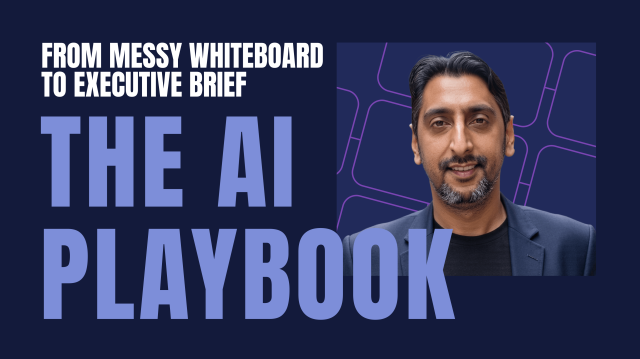
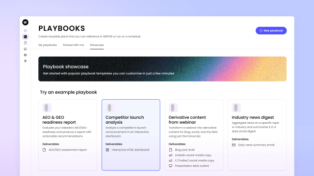
From messy whiteboard to executive dashboard in minutes, not days
Ben Popper


Humans in the loop
– 5 min read
The metagame: How WRITER’s Diego Lomanto reads the agentic future of marketing
Alaura Weaver
Innovation
– 10 min read
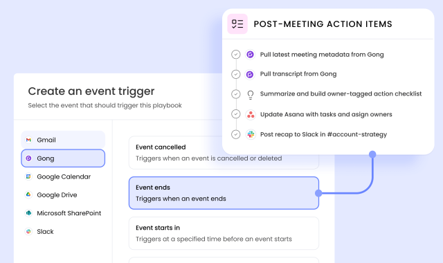
New at WRITER: More autonomy for agents, more control for admins
Writer Team
Innovation
– 17 min read
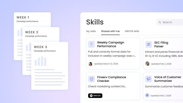
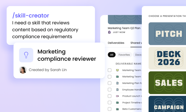
How WRITER Skills turn your team’s expertise into reusable AI capabilities

Marisa Almeida


Inside WRITER
– 5 min read
Beyond “the AI show”: Operationalizing agents at the WRITER Chicago roadshow

Lindsay Poirier, Area Vice President, Sales

Inside WRITER
– 4 min read
Your AI journey starts here

April Trask, Head of Customer and Partner Education

Inside WRITER
– 5 min read
Introducing the new partner program enterprise AI actually needs

Maureen Little, SVP of Partnerships and Ecosystem