Words at work
– 10 min read
Accessible writing is just good writing
The Writer Team
Accessibility is a big, complex topic that touches every aspect of human life. In the digital realm alone, designing for accessibility involves an almost overwhelming variety of best practices. You only have to scan The Web Content Accessibility Guidelines published by the World Wide Web Consortium (W3C) to get an immediate sense of how many different elements go into creating fully accessible content.
Content strategists must be proactive about improving accessibility. According to the World Health Organization (WHO), more than a billion people experience some form of disability, and many of these disabilities — such as blindness and low vision, deafness and hearing loss, limited movement, speech disabilities, and photosensitivity — affect how a person experiences digital content.
In the not-so-distant past, many organizations did little more than apply accessibility Band-aids like adding alt text to images. Fortunately, accessibility has become part of the mainstream content conversation, and organizations are learning a lot more about what’s at stake and how to do a better job at making their content available to a wider audience.
The good news is that making content more accessible is a win-win. It makes it possible for people with disabilities to access and enjoy your content, and it also delivers a better experience for everyone else. Put simply, accessible writing is just good writing. It works for everyone.
In this article, we’re going to touch on some of the core, foundational elements that make your content more accessible to a wider audience. We’ll touch on:
- The key attributes of accessible writing
- Examples of companies that get it right
- Some material you can cut and paste into your style guide
- Tips on strategies to help you implement accessibility best practices across your organization
You and your team work really hard on your content. You owe it to yourselves and to your audience to create an accessible content experience. This starter guide will help you identify places where you can start to build a strong foundation for that experience.
Use precise language and a functional structure
If your content is easy to understand, more people will be able to engage with it. When developing content, remember that not everyone has the same experience, background, or reading level. One rule of thumb is to write for an average literacy level.
Using clear language also helps you build trust with your audience. For example, in our plain language guide, we noted that the number one factor that increases consumer trust is easy-to-understand “terms and conditions” (according to the Edelman Trust Barometer ). Bottom line: aim for maximum readability.
Key question:
Will the meaning be clear to my intended audience?
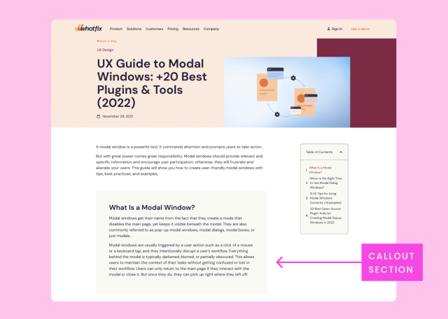
Keeping your writing simple can be difficult if you need to include complex terminology. Whatfix includes callout sections to explain terms that might confuse the reader.
For inspiration on how to explain complex topics simply, check out the ELI5 (Explain Like I’m Five) Reddit thread.
Tips to steal for your style guide
- Use plain language and short sentences
(aim for a maximum of 25 words per sentence) - Use short paragraphs
(aim for a maximum of five sentences per paragraph) - Use the active voice instead of the passive voice wherever possible
- If you use acronyms, abbreviations, or complex terms, explain them clearly
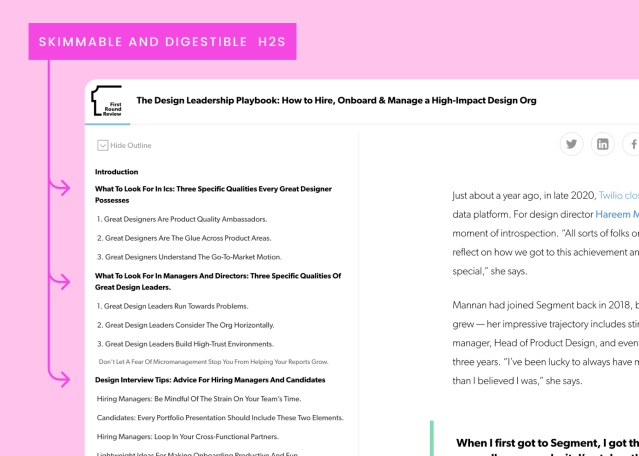
Organize your content with titles, headers, and bulleted lists
A logical and clear structure goes a long way toward making content more accessible and easier to understand, whether or not the reader has a disability.
It’s much easier for a screen reader to correctly process a piece of content if it is well-structured using a page title and subheadings to organize the text. A clear and thoughtful structure is also important for SEO (search engine optimization) because it helps search engines understand what’s on your website.
Using headers and bulleted lists also makes it easier for readers to skim your content, which helps them quickly assess if it can answer their questions. Making content skimmable is a critical way to keep readers engaged and get them to the content they need as quickly as possible. The Animalz Benchmark Report found that the median time spent on a page in 2021 was three minutes and nineteen seconds. That’s not a lot of time to make the right impression. If you don’t put your important content in obvious places, people won’t stay around long enough to read it.
Key question:
Does my content make sense if someone only reads the headers?
Tips to steal for your style guide
- Break your text up into digestible sections
- Use headings to make text skimmable
- Create a hierarchy of information: your most important points should stand out
- Organize text with heading levels: an H1 followed by H2s, H3s, and H4s
- Use lists to summarize long or complex content
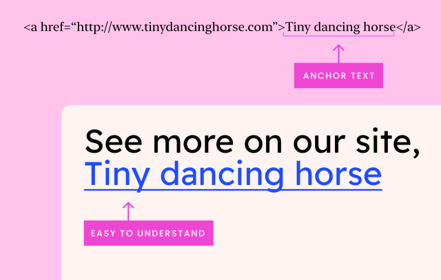
Use meaningful link text
A study by The Lancet found that, as of 2020, 43.4 million people live with blindness, and 295 million live with visual impairments or low vision. People using screen readers to access web pages sometimes listen to a list of links at the start of the article instead of accessing them in the context of the article. To avoid confusion, your links should make sense out of context, meaning someone can understand what’s behind the link based on which words are linked. In Moz’s SEO guide, they advise making sure your link text is “succinct” and “relevant” to the page it’s linking to.
Another thing to note is that readers using speech recognition software select links with voice commands. If you use the same link text multiple times, these readers won’t be able to tell which link is the one they want.
It’s also a common mistake to link directly to a download or content that automatically opens in a new window. This can be confusing for everyone, but especially for people using assistive technology. Make sure you inform readers about the new window right in the link text. For example, instead of just writing “annual report,” write “download our annual report as a PDF” or “our annual report (opens in a new tab).”
Key question:
Do my links make sense out of context and provide a clear sense of where they lead?
Tips to steal for your style guide
- Write descriptive link text that makes sense out of context — avoid “click here”
- Limit links to 100 characters
- Use unique link text where possible
- Inform users if a link will automatically open in a new tab or download a file
- “Click” is not an inclusive instruction. Use “select” instead.
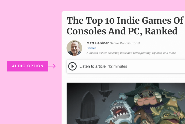
Provide content in different media formats
There are many reasons that someone might want to access your content in a variety of different media formats:
- They might use assistive technology like reading pens or screen readers that convert text to audio.
- They might have different learning styles or be neurodivergent — for example, folks with ADHD (attention deficit hyperactivity disorder) or autism — and need to process information in different ways to retain it.
- They might be experiencing content that isn’t in their native language.
- They might be in an environment that makes it difficult to hear or see clearly (for example, on public transportation or in a crowded office).
Key question:
Is my content appropriate and adaptable for more than one medium or learning style?
Write descriptive alt text
It’s important to add descriptions or alternative text (“alt text”) to your images so your visual content can be accessed by people who are blind or living with other visual impairments.
Key question:
Does the alt text on my images include enough detail to be helpful to someone who can’t see it?
Moz suggests creating alt text that’s descriptive enough so that if someone were to read the alt text, they could imagine what the image looks like.

In this example, “man on escalator” is okay, but the best alt text is more specific: “man wearing backpack walking down escalator.”
Alt text should be succinct. If you need to write a longer description, put it in the main body of the text.
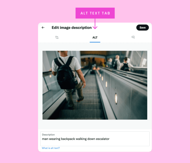
Many apps, like Twitter, now offer the option to add alt text to your images within the platform. If the platform doesn’t offer the option, simply write a description in the caption.
Tips to steal for your style guide
- Write alt text that’s equivalent to the visual content
- Explain images fully in context — unless they are purely decorative
- Make alt text succinct (aim for 80-125 characters)
- Make sure that any text in a graphic format is purely decorative
- If your images include important text (such as in an infographic), write this information in the caption or in the main body
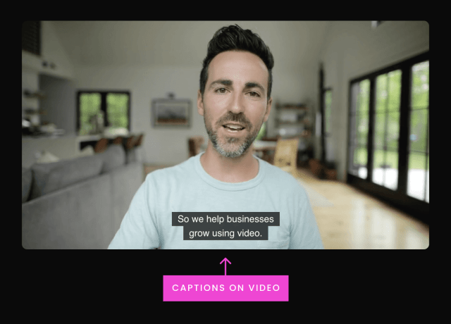
Include captions, transcripts, and audio options
Adding captions and transcripts to your video and audio content is a valuable way to give people options about how they want to interact with and experience your content. Screen readers help people convert text to audio, but you may also want to consider creating a dedicated audio option for written content.
Key questions:
Does my content include easy-to-follow instructions, helpful descriptions, and clear labels to guide people? Is my content available in a variety of visual and audio formats?
Optimize your writing for easy navigation and usability
Well-written and well-organized content makes for a better user experience. It keeps people engaged with your site or app, and makes sure they have a positive experience.
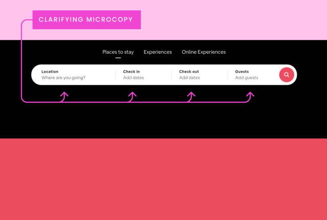
To make it easier to navigate their site, Airbnb uses microcopy to clarify what to type in each field in the search bar. For example, under the label “Location,” it says, “Where are you going?”
Work with your web developers to make sure you:
- Use the correct HTML tags for the content type.
- Ensure good color contrast (so text can be read by people with color blindness) — or offer the option to increase color contrast, like Twitter does.
- Make your site accessible to people who rely on their keyboard to navigate, for example, by providing keyboard shortcuts, like Facebook does.
- Format your web content for mobile phones and different device sizes. We recommend checking out the Bitrise mobile accessibility guide.
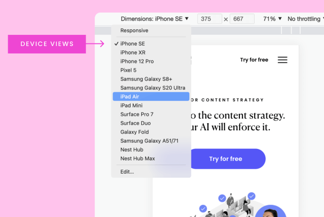
Many content management systems offer dynamic templates, and you can use developer tools in Google Chrome to check how your site looks and responds at different screen sizes.
Tips to steal for your style guide
- Avoid directional language like “click the box on the left”
- Write instructions that make sense regardless of the page layout
- Write descriptive form labels, so it’s clear exactly what people need to enter
Test your content for accessibility
The best way to ensure maximum usability for the widest audience is to conduct extensive testing with a diverse group of people across different devices and different software.
Here are some tools for checking your content’s accessibility:
- OpenClassrooms course: A guide on how to access your content with assistive technologies
- axe DevTools and WAVE (Web Accessibility Evaluation Tool): Extensions that identify accessibility issues. Sparkbox recommends them in their review of automated accessibility tools.
- OpenDyslexic: A font plug-in that makes it easier for people with dyslexia to read web pages.
Key takeaway: Don’t assume that just because your content works for you that it will work for everyone.
Collaborate with your team for consistency
Your content exists in an interconnected ecosystem that spans a network of topics, channels, formats, and audiences. To create a consistent and seamless user experience, everyone on your team needs to understand what makes content accessible.
Jennifer Schmich, Intuit’s senior manager of content systems, says accessibility affects almost every aspect of their content — including the code, design, and language choices. “When it comes to inclusivity, we always ask ourselves, ‘Are our customers seen?’” Schmich says.
The first step to getting your team on board with improving accessibility is to start with clear communication about why you’re making changes to your style guide. By helping people understand the reasons behind these changes, they’ll be more likely to take ownership over their role in the effort.
Set up regular check-ins to stay on top of progress, setbacks, and new opportunities. Making your content accessible is definitely not a once-and-done effort. It’s important to establish ongoing reviews and updates as part of your overall content development and publishing process. You can use a collaborative tool like Trello to keep everyone on the same page and define roles and tasks.. For best results, avoid attempting sweeping changes. Instead, break your accessible transformation down into small tasks and assign them to different team members.
Accessible writing is an ongoing process
Like we said before, accessibility is a huge topic. If you try to take the whole thing on at once, there’s a good chance you’ll end up feeling overwhelmed. The most realistic and effective approach is to start small and gradual, and then keep making steady improvements over time. If you adopt this kind of strategy, you’ll be in good company. The truth is that even the biggest, most sophisticated companies in the world haven’t gotten accessibility completely figured out. We’re all on this journey together.
The W3C has some helpful suggestions for how to get started on their Writing for Web Accessibility page. Again, don’t feel like you have to do everything at the same time. Pick one or two areas to focus on, and remember to share the responsibility with your teammates.
At the same time, you might want to work on adding some of the tips we shared in this article to your style guide, and scheduling some time to talk with your team about accessibility. There’s a lot to be said for simply getting the conversation started.
More resources


Words at work
– 9 min read
The marketing leaders’ guide: surviving (and thriving) in 2023

Michelle Newblom